Top 7 best fonts for resumes in 2025: craft a winning first impression

In the 6–7 seconds a recruiter spends skimming your resume (TheLadders 2025 report), your font shapes their first impression before skills or experience register (Microsoft’s 2025 guide).
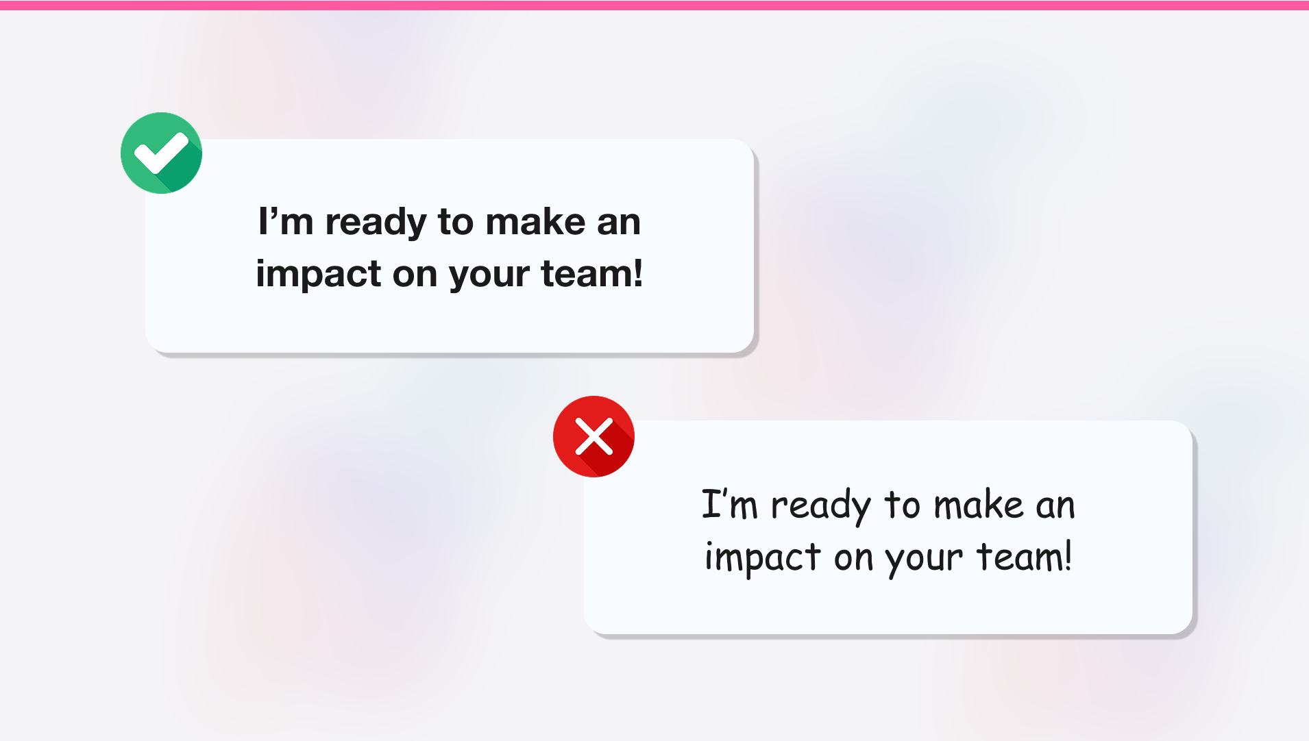
Typography does more than look good. It signals trust, guides the reader’s eye, and ensures your resume plays nice with Applicant Tracking Systems (which often struggle with quirky or stylized fonts).
Choosing the right resume font is more than an aesthetic choice, it’s your introduction before a single word is read.
In this guide, you’ll learn:
- The best resume fonts for 2025.
- How typography influences perception.
- How to combine fonts for clean, impactful resumes.
- Common resume font mistakes to avoid.
Let’s dive in.
Top 7 best fonts for resumes (with examples & pairings)
The best resume fonts for 2025 strike a balance between readability, professionalism, and ATS compatibility. They help your skills shine clearly — on screen, on paper, or through software parsing. Below are the seven best fonts to use in resumes this year, with notes on strengths, drawbacks, and ideal pairings to tailor the impression you want to make.
Garamond
Serif Font. Timeless and refined, it suggests depth and credibility.

Why it works
- Its delicate design signals maturity.
- Great for senior roles in law or academia.
- ATS-safe.
- Be cautious: tight spacing can hinder readability on screens.
Ideal Pairing
- Helvetica: crisp and modern for headings.
- Lato: for a friendly, balanced pairing.
Helvetica
Sans-serif Font. Confident, versatile, and modern. Current without being trendy.

Why it works
- A design classic.
- Easy to read and ATS-friendly.
- Sharp in both print and digital formats.
- Suits nearly any field.
Ideal Pairing
- Georgia: to balance modern with classic strength.
- Baskerville: adds sophistication to headings.
Lato
Sans-serif Font. Friendly polish. Innovative but grounded.

Why it works
- Designed for clarity with warmth.
- Open spacing, rounded edges, and strong readability make it ideal for modern resumes.
- ATS-compatible.
Ideal Pairing
- Merriweather: a character-rich serif that enhances headings.
Roboto
Sans-serif (Google's) Font. Structured and modern. It’s bold but too assertive for conservative fields.

Why it works
- Sharp at small sizes and highly readable.
- Ideal for information-dense resumes.
- ATS-compatible.
Ideal Pairing
- Open Sans: softens the tone and adds approachability.
Georgia
Serif Font. Elegant yet readable. Classic with a contemporary feel.

Why it works
- Tall letters boost scannability.
- Optimized for screens.
- ATS-compatible.
- Great for roles that balance formality and friendliness.
Ideal Pairing
- Open Sans: adds modern clarity to a traditional layout.
Montserrat
Sans-serif Font. Bold and modern. Its rounded edges and clean lines give off a vibe that’s confident and energetic.

Why it works
- Inspired by urban signage, it’s clean, geometric, and highly readable.
- ATS-compatible.
- Looks great on both screens and paper.
Ideal Pairing
- Noto Serif: adds classic poise to your headings.
Inter
Sans-serif Font. Clean, geometric, friendly. Great for anyone applying to modern companies.

Why it works
- Compact and versatile.
- ATS-compatible.
- Built for screens.
- Ideal for detailed resumes.
Ideal Pairing
- EB Garamond: adds elegance to headers without clashing.
Serif fonts still resonate in more traditional sectors, but the overall shift reflects how resumes are increasingly reviewed on screens, not printed.
How to combine fonts for a polished resume
A single font ensures simplicity, but strategic font pairing adds polish, guiding recruiters’ eyes to key sections while showcasing attention to detail. Here’s how to do it effectively:
- Select a body font: choose one from the list above for its readability at 11-12pt and ATS compatibility. This carries your resume’s main content.
- Add a heading font: it should contrast slightly from your body font, but not compete with it. This draws attention to your name, section headers, and titles.
There are two common pairing strategies:
- Serif + Sans-serif: combines tradition with modernity, like blending classic and contemporary design. It feels balanced and guides the reader naturally.
- Same-family variation: stick to the same font but change weights or styles (e.g. regular for body text, bold or uppercase for headers or highlights). This method is safer if you’re unsure about mixing fonts or want a cleaner aesthetic.
Thoughtful font pairing reflects precision and professionalism. Limit to two fonts to maintain clarity, ensuring your resume feels intentional and impactful.
How fonts shape first impressions: the psychology of typography
Before a recruiter reads a word, they’ve already formed an impression. In milliseconds, our brains interpret visual cues: alignment, white space, and especially, font. It’s not just aesthetics, it’s neuroscience.
Let’s unpack how fonts influence perception, and why they silently steer a recruiter’s emotional and cognitive reaction to your resume.
1. Fonts spark instant judgments
Imagine meeting someone new. Their posture or smile gives you a vibe before they speak. You don’t consciously analyze someone’s posture, but you do feel something when you see it. A 2023 MIT study found that typography affects how people perceive trustworthiness, intelligence, and professionalism in milliseconds; faster than any bullet point can.
Different fonts send different signals:
- Sans-serif fonts (Inter, Helvetica): modern, clear, efficient.
- Serif fonts (Georgia, Garamond): established, credible, reliable.
- Rounded fonts (Lato): friendly, open, creative.
- Decorative or script fonts (Brush Script): avoid for resumes, unprofessional and hard to read.
Recruiters may not notice your font consciously, but their brain reacts. And that first impression lingers.
2. Fonts affect resume readability and skimming
Your resume will most likely be skimmed, not read word-for-word. And readability drastically increases your chances of getting noticed.
A great font delivers:
- Visual hierarchy: bold headings highlight what matters most.
- Flow: guiding the eye naturally through sections.
- Clarity: making content easier to skim and absorb.
| 🟢 What works | 🔴 What hurts |
|---|---|
| Clean sans-serif or transitional serif fonts | Thin, stylized fonts (Bodoni, Brush Script) |
| Adequate white spacing between lines (1.2-1.5 line height) | Tight spacing or poor kerning |
| Consistent formatting for sections and bullet points | Low contrast between font color and background. |
| Font sizes: 10-12pt (body), 13-16pt (headings) | Font sizes below 10pt |
Think of your font like movie subtitles: if they’re perfect, you barely notice; if they’re bad, you can’t focus on anything else.
3. ATS-friendly resume fonts: why it matters more than you think
Most companies use Applicant Tracking Systems (ATS) to pre-screen resumes. These systems convert your resume into plain text to match it to job keywords. But if your font is too stylized or embedded incorrectly, key information can get lost, or your resume might not render at all.
To stay ATS-safe:
- Use system fonts or Google Fonts.
- Stick with text-based content (never images or special effects).
- Save as PDF or DOCX using standard, embeddable fonts.
Common resume fonts mistakes to avoid
Great fonts quietly support your resume. Bad ones shout over your content. These fonts might be iconic or even fun, but on a resume, they send all the wrong signals. Here’s a rundown of fonts to steer clear of:
Comic Sans
Universally disliked in professional settings, which undermines your credibility.

Papyrus
Overused and mocked (think Avatar memes); it lacks clarity and it’s hard to read at small sizes.

Courier New
Bulky and hard to scan quickly, monospacing makes it inefficient for resumes.

Times New Roman
A 2023 Forbes article called it the “sweatpants of fonts”; safe, but uninspired.

Script fonts
Elegant at a glance, but hard to read at small sizes and ATS-unfriendly.

Futura
Lacks warmth and fluidity for body text, plus it's got poor readability in paragraph form.

"Handwritten" fonts
They come off as gimmicky or immature, which hurts credibility in any professional context.

Beyond choosing problematic fonts, other missteps can undermine your resume. Using sizes below 10 pt strains readability, while mixing more than two fonts creates visual chaos. Inconsistent formatting (such as varying font styles across sections) disrupts flow; and low-contrast colors (e.g., gray on white) obscure text. Overusing bold or italics dilutes impact, burying the things that should really be highlighted. These errors distract recruiters and risk ATS parsing issues, so keep typography clear, cohesive, and professional to ensure your resume shines.
Let your font work as hard as you do
Your resume font isn’t just decoration, it’s part of your pitch. It sends a message in milliseconds about who you are, whether you’re trustworthy, and if your resume is worth a second look.
Choose a professional, clean, and ATS-friendly font that reflects your role, industry, and personal style. Keep it legible, polished, and purposeful. Recruiters may not notice a great font, but they’ll definitely notice a bad one.
Ready to build a stunning, professional resume with perfect font pairings?
We're two product builders who care about quality, taste and doing things right. We want you to get that job you want, plain and simple. That's why we are building CandyCV to help you create a great resume and land a job for free. If you give us a try (and feedback!), we'll be forever grateful 😊
Alba Hornero
Co-founder and Product Builder
As CandyCV’s co-founder and a former product lead in HR tech, I’ve built ATS tools, optimized hiring processes, and interviewed hundreds of recruiters. I personally write every post with the intention to provide real, high-impact job search advice that truly helps you land your next role.